McDonald’s is one of the most loved international franchises around the world, including in Pakistan. While everyone is a fan of their fries, cones, and food, we can’t say the same about their new logo.
The food giant shared a post on its official social media page with the caption ‘get ready’ and even changed its profile picture.
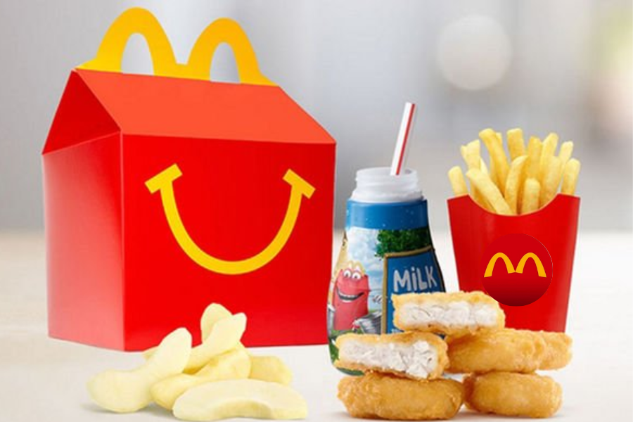
While it’s very noticeable that the logo is the same arch that we’ve seen on Happy Meal boxes, followers are wondering why did McDo make this move in the first place.
https://www.facebook.com/McDonaldsPK/posts/6244148838929044
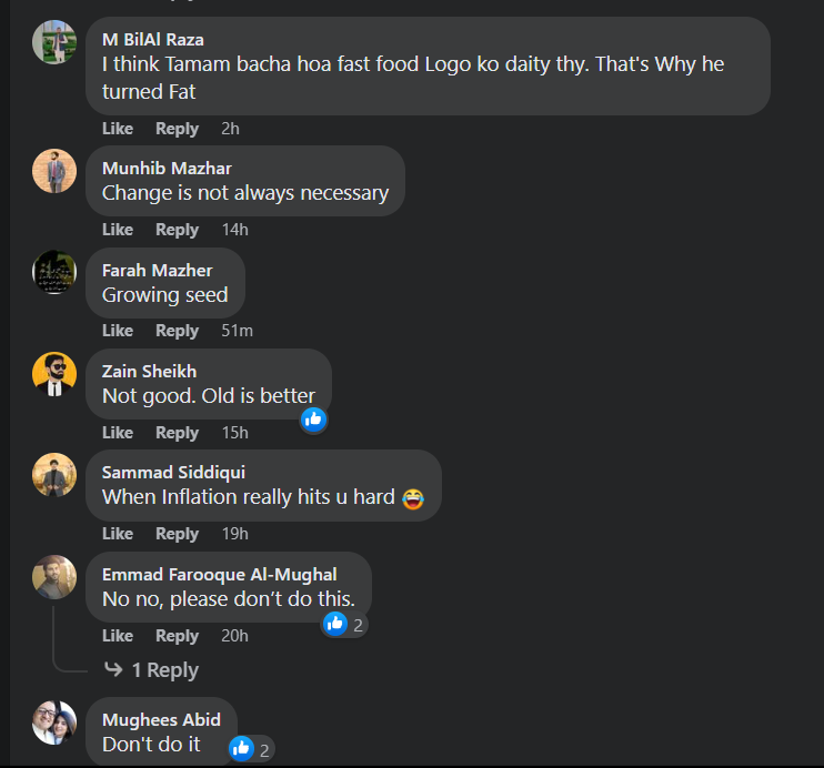
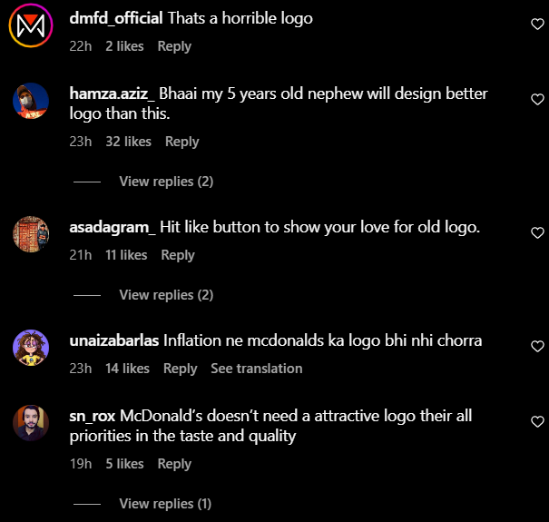
Since the post-drop, fans have been making fun of the logo and are calling out the brand for what could be termed one of the worst revamps in history.
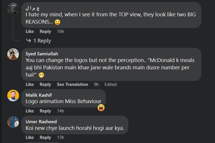
On the other hand, as unfortunate as it is, some Pakistanis could not help themselves and started to compare the logo and the animation to certain female body parts.
Global Brand Balenciaga Apologies Over Controversial Children’s Campaign
Social Media Reactions to McDonald’s Logo
Here’s how Pakistanis reacted to the revamp:


McDonald’s Pakistan is the Pakistani affiliate of the international fast food chain, McDonald’s. Its first restaurant was established in Lahore, followed by a second restaurant a week later in Karachi, in September 1998.
McDonald’s Pakistan currently operates 72 outlets across 24 major cities nationwide, serving millions of customers. Its franchise locations include Karachi, Lahore, Faisalabad, Islamabad, Rawalpindi, Gujranwala, Peshawar, Multan, Hyderabad, Quetta, Sargodha, Bahawalpur, Sialkot, Sukkur, Sheikhupura, Rahim Yar Khan, Dera Ghazi Khan, Gujrat, Sahiwal, Abbottabad and Jhelum.
The largest number of outlets is in Lahore, followed by Karachi and Islamabad-Rawalpindi.
IBA Alumnus Shakir Moin Announced as New Marketing Lead for Coke North America
McDonald’s Logo History
This is not the first time the food giant was called out for a tasteless and horrendous revamp. The McDonald’s logo has undergone several changes throughout the years.
The original logo, designed in 1961 by Stanley Meston, featured the “Speedee” character, which was a chef wearing a chef’s hat and holding a hamburger. This logo was used until 1962.
In 1962, the company introduced a new logo that featured the “Golden Arches” of the “M” in “McDonald’s” in a stylized form. This logo was designed by Jim Schindler and was intended to symbolize the “structure of the company’s backbone.” The design of the arches has varied over the years, with different thicknesses and different angles of the connecting point, but the basic design has remained unchanged.
In 1968, McDonald’s changed the design of the logo again, this time to feature a stylized “M” in a circle. This logo was used until 1975.
In 1975, McDonald’s introduced the current logo, which is the “Golden Arches” again, but this time, the word “McDonald’s” was written in a stylized font, and the arches were now arched.
In 2016, McDonald’s added a new version of its iconic logo, which is only the arches, without the word “McDonald’s”, that is meant to be used for new digital and mobile platforms.
What are your two cents about the logo? Share them with us in the comments below.
Stay tuned to WOW360.
Bisconni’s #SochKaFLObadlo Campaign Promotes Gender Equality & We’re Loving It
