
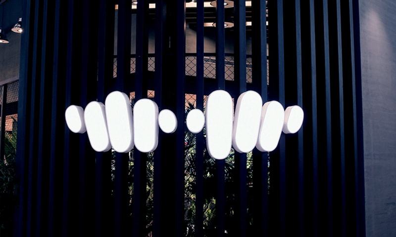
Pakistani fashion and lifestyle brand, Khaadi has received an overwhelming response on its latest campaign “Redefining Our Mark of Expression” on social media. Quite literally, the brand is moving towards redefining its mark of expression, or some would suggest, losing its real identity.
In Khaadi’s latest post on social media, we discovered that the brand is repositioning/rebranding the look and feel of how the Khaadi products will be marketed in the future as well as a new logo. The swift transition was apparent with Khaadi’s Independence Day ad Ft. Hasan Raheem & Risham Faiz Bhutta.
The brand said on its Facebook page, “Starting from a single thread, our story has unraveled over the years to become even more exciting. Stay with us as we create the mark of expression. Now, it is your turn to express yourself, tell your story, be yourself, and wear yourself.”
The first Khaadi logo, which is still loved by many, came out in December of 1998. It depicted a weaver’s hands holding a loom. The original logo had a bar underneath it representing the handloom. From 2010 to 2013, there were changes made, however, in 2018 only the weaver’s hands remained and became Khaadi’s identity. It was no longer required to put the name of the brand on the logo, which was considered a great marketing success.
Customers and Industry Experts Gave Mixed Reviews on Khaadi’s Latest Logo and the Brand Actively Repositing its position
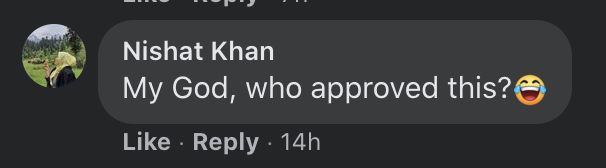
Some customers were annoyed by the conversation and pointed out that what’s the discussion over.
You all losing shit over Khaadi logo as if you are going to wear the logo. Chup ker jao
— berbaad kacchay 🩲 (@mahobili) October 6, 2021
Khaadi ka new logo ksi diaper product ka lag raha hay.
— Mahayyy (@ThisThisnThz) October 5, 2021
Some hated the new logo right off the bat
khaadi what the fuck is that ugly new logo WHO APPROVES THESE REDESIGNS I JUST WANNA TALK 🤮🤮🤮
— Faizan. (@thoraoffbeat) October 5, 2021
khaadi's logo is now as ugly as their labor practices 😍😍 pic.twitter.com/9ZqBLDhtlP
— Faizan. (@thoraoffbeat) October 5, 2021
I’m so mad at the new khaadi logo aghhhhh stop trying to fix something that’s not broken their old logo was literally timeless and iconic. they’re trying way too hard to be modern and contemporary
— 🥐✨👡 (@hepburntout) October 5, 2021
Khaadi ne waise kisi se naye logo k baray mein pucha bhi tha ya sab aese hi muft mashwara de rahay hain?
— aliterate (@quettavaal) October 5, 2021
A Twitter user said that she is ‘willing to bet that Khaadi logo redesign happened because a new Marketing Director was hired’. In her opinion, the move was for personal gain.
Willing to bet tht Khaadi logo redesign happened because a chuss new Marketing Director was hired and he/she wanted to have a repositioning/rebranding on their CV. Seen this happen ALL the time. Brands ppl rarely fix it when its broke, & mostly break it when it doesnt need fixing
— 🌻Bissmah Mehmud (@bissmahmehmud) October 6, 2021
khaadi ne logo redesign kar khud ka hi khadda khod dia 👍🏼
— ¿¡ (@prowhinerr) October 5, 2021
Some just took their time but finally announced they weren’t pleased with the latest logo
I don't like Khaadi's new logo. There, I said it!
— Alina (@ninacaresforu) October 5, 2021
Comments on Facebook also depicted that people liked the previous logo better
Customers didn’t understand the point of changing the logo, the previous was “brand’s identity”. “What’s the point in changing it?”
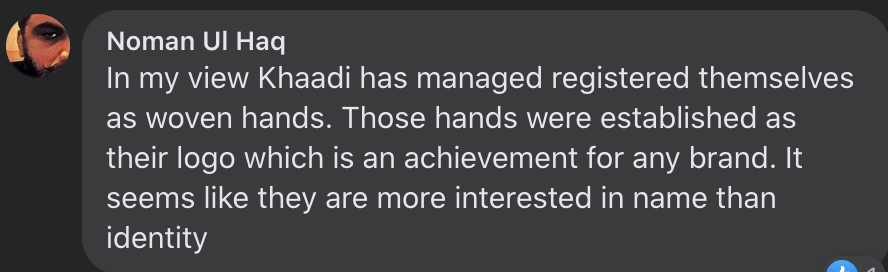
Khaadi’s weaver’s hands were established as their logo which is an achievement for any brand.
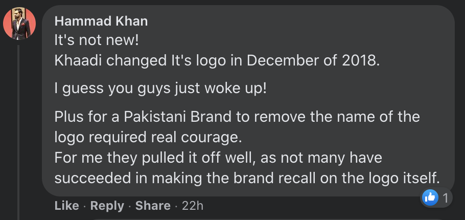
Apparently, the change was made in December 2018, according to a Facebook user. However, someone said it must have been poorly executed as no one noticed.
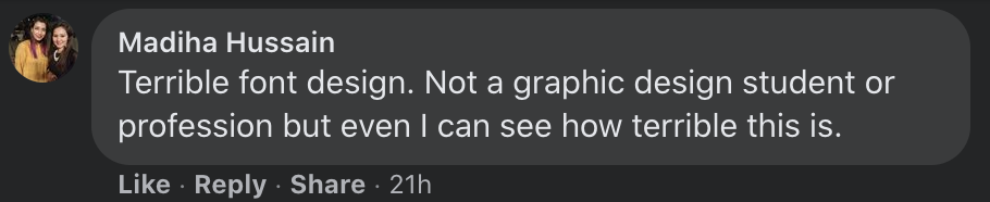
Other than calling the font close to nickelodeon’s, a Facebook user pointed out that neither is she a graphic designer student, nor a professional, yet she was able to point out the font design is terrible.
Khaadi Features Plus-Size Model in their Latest Campaign Addressing a Much Needed Category. Read the full story here:
Pakistani fashion brands have evolved over the years. Experts have observed the market closely and have successfully adopted strategies to cater to their customers belonging to different categories. However, the plus-size has often been ignored by fashion brands and retailers in the country, especially when it comes to pret.
Khaadi Features Plus Size Model in their Latest Campaign Addressing a Much Needed Category
Have something to add? Let us know in the comments section below.
For more news and updates, stay tuned to Wow 360.